Enterprise Software
Platinum Pension Administration Platform
Enterprise redesign of a legacy pension administration SaaS platform (SIPP & SSAS).
Summary
I led the ground-up redesign of a legacy SIPP/SSAS pension administration platform and supported phased delivery through 2017-2020, with ongoing compliance-led iteration to keep pace with HMRC and regulatory change. The work focused on admin productivity, accuracy, and operational control: simplified navigation and IA, standardised grids and workflows, reduced errors through controlled inputs and consistent validation, and introduced operational visibility through queues, statuses, KPIs/MI, SLA visibility, exception handling, and auditability. I also established design system foundations and WCAG-aligned patterns so changes could scale across modules without UI drift.

Platinum redesigned experience. A modern, scalable interface for high-volume SIPP and SSAS administration.
OUTCOMES
Commercial Impact
Prototype-led demos and the modernised experience supported client confidence, adoption, and growth (including reported first-year profitability).
How measured:
Usability walkthrough timing (pre vs post), click-count comparisons on key journeys, and training/support signals during phased rollout.
Challenges
Key pain points included:
Before & After

Before
Before: Legacy table view with dense columns and cluttered controls

After
After: Redesigned grid with focused views and progressive disclosure
Before and after. From 60+ column tables to focused views with search, filtering, and progressive disclosure.
GOALS
Wireframes & Early Concepts
Exploring layout, flow, and hierarchy before design polish


Early-stage wireframes helped define structure, content hierarchy, and user flows before committing to high-fidelity design. They allowed for faster feedback cycles, stakeholder alignment, and iterative testing of critical interactions, saving time downstream in development.
Design System
UI Redesign & Visual Hierarchy
I completely overhauled the visual design, removing clutter and applying modern UI standards. I prioritised visual hierarchy, typography, and spacing to deliver a cleaner, more intuitive interface.
Metric/Outcome
Reduction in training time for new users
In user satisfaction scores


Streamlined
Simplified Navigation & Information Architecture
Replaced the fragmented navigation with a clear, left-aligned vertical structure supported by mega menus, breadcrumbs, and contextual tabs. This enabled users to locate key areas like Contributions, Transfers, and Benefit Crystallisation Events within 1-2 clicks instead of 5-6.
Metric/Outcome
Reduction in Average Time Spent navigating Menus.
Increase in successful task completion without external support.

Efficiency
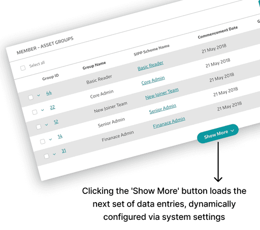
Dynamic Data Loading
To improve page load times, I introduced "Show More" CTAs and integrated inline search, helping users manage large datasets without overwhelming the interface.
Enhanced Usability
Smart Interactions


Contrast-safe hierarchy and readable typography
Predictable form behaviours and error messaging
Keyboard-friendly interaction patterns with visible focus states
Component specifications to support accessible implementation by engineering, aligned to WCAG 2.1 AA goals
Design System Foundations
I established design system foundations to reduce UI drift and speed delivery across modules, including reusable components, states, spacing rules, and interaction standards.
Metric/Outcome
Reduction in UI-related development rework.
Faster development cycle for new features.


Prototyping & Testing
I created over 2000 high-fidelity prototypes that simulated genuine interactions. These prototypes were evaluated by pension administrators and refined based on their qualitative feedback.
Metric/Outcome
Increase in usability testing success rates.
Reduction in post-launch user complaints.
Resulted in a design that directly addressed real user pain points.
Increased user satisfaction and confidence in system usability.

Research & Discovery
Worked with pension administrators, BAs, product and delivery leads to uncover bottlenecks, inconsistencies, and unmet needs across key processes.
Observed live usage to capture real behaviour, workarounds, edge cases, and friction that doesn't surface in interviews.
Benchmarked UI patterns, navigation flows, form behaviours, and data layouts to identify repeated failure points.
Mapped end-to-end workflows to identify gaps, duplicated steps, and points where users got stuck or lost.
Reviewed comparable pension/fintech platforms to identify modern UI approaches to dashboards, reporting, and workflow management.
Regular walkthroughs and prototype reviews with real users, iterating designs based on qualitative feedback.
Reflection
In pension administration, UX is never 'done'. The platform must continuously adapt to compliance and HMRC-driven change. The long-term win was establishing scalable patterns (grids, workflows, navigation) and design system foundations so the product could evolve without UI drift or constant rework.
"/><stop offset="1" stop-color="rgba(168, 85, 247, 0.7)"/></linearGradient></defs><g d="M 0 14 C 0 6.268 6.268 0 14 0 L 34 0 C 41.732 0 48 6.268 48 14 L 48 34 C 48 41.732 41.732 48 34 48 L 14 48 C 6.268 48 0 41.732 0 34 Z M 30 18 L 18 18 C 17.172 18 16.5 18.672 16.5 19.5 L 16.5 28.5 C 16.5 29.328 17.172 30 18 30 L 30 30 C 30.828 30 31.5 29.328 31.5 28.5 L 31.5 19.5 C 31.5 18.672 30.828 18 30 18 Z M 31.5 20.5 L 24.773 24.775 C 24.3 25.071 23.7 25.071 23.227 24.775 L 16.5 20.5" fill="transparent" height="48px" id="RD03ycJ7h" width="48px"><path d="M 0 14 C 0 6.268 6.268 0 14 0 L 34 0 C 41.732 0 48 6.268 48 14 L 48 34 C 48 41.732 41.732 48 34 48 L 14 48 C 6.268 48 0 41.732 0 34 Z" fill="url(%23UBkH_84o4-2645693222-linear-gradient)" height="48px" id="UBkH_84o4" width="48px"/><path d="M 13.5 0 L 1.5 0 C 0.672 0 0 0.672 0 1.5 L 0 10.5 C 0 11.328 0.672 12 1.5 12 L 13.5 12 C 14.328 12 15 11.328 15 10.5 L 15 1.5 C 15 0.672 14.328 0 13.5 0 Z" fill="transparent" height="12px" id="g2WQr16BD" stroke-dasharray="" stroke-linecap="round" stroke-linejoin="round" stroke-width="1.5" stroke="rgb(124, 134, 255)" transform="translate(16.5 18)" width="15px"/><path d="M 15 0 L 8.273 4.275 C 7.8 4.571 7.2 4.571 6.727 4.275 L 0 0" fill="transparent" height="4.497321615343026px" id="zzJBlWQur" stroke-dasharray="" stroke-linecap="round" stroke-linejoin="round" stroke-width="1.5" stroke="rgb(124, 134, 255)" transform="translate(16.5 20.5)" width="15px"/></g></svg>)
"/><stop offset="1" stop-color="rgba(168, 85, 247, 0.7)"/></linearGradient></defs><g d="M 0 14 C 0 6.268 6.268 0 14 0 L 34 0 C 41.732 0 48 6.268 48 14 L 48 34 C 48 41.732 41.732 48 34 48 L 14 48 C 6.268 48 0 41.732 0 34 Z M 15 15 L 33 15 L 33 33 L 15 33 Z M 31.498 27.69 L 31.498 29.94 C 31.5 30.362 31.324 30.766 31.012 31.052 C 30.701 31.337 30.284 31.478 29.863 31.44 C 27.555 31.189 25.339 30.401 23.391 29.138 C 21.579 27.986 20.043 26.45 18.891 24.638 C 17.623 22.681 16.834 20.453 16.588 18.135 C 16.55 17.716 16.69 17.3 16.974 16.989 C 17.258 16.678 17.66 16.5 18.081 16.5 L 20.331 16.5 C 21.084 16.493 21.726 17.044 21.831 17.79 C 21.926 18.51 22.101 19.217 22.356 19.898 C 22.562 20.446 22.43 21.064 22.018 21.48 L 21.066 22.433 C 22.134 24.311 23.688 25.865 25.566 26.933 L 26.518 25.98 C 26.935 25.568 27.553 25.437 28.101 25.643 C 28.781 25.896 29.488 26.073 30.208 26.168 C 30.962 26.274 31.517 26.929 31.498 27.69 Z" fill="transparent" height="48px" id="qz03A0Evi" width="48px"><path d="M 0 14 C 0 6.268 6.268 0 14 0 L 34 0 C 41.732 0 48 6.268 48 14 L 48 34 C 48 41.732 41.732 48 34 48 L 14 48 C 6.268 48 0 41.732 0 34 Z" fill="url(%23LVO83Orll-3130066706-linear-gradient)" height="48px" id="LVO83Orll" width="48px"/><g d="M 0 0 L 18 0 L 18 18 L 0 18 Z M 16.498 12.69 L 16.498 14.94 C 16.5 15.362 16.324 15.766 16.012 16.052 C 15.701 16.337 15.284 16.478 14.863 16.44 C 12.555 16.189 10.339 15.401 8.391 14.138 C 6.579 12.986 5.043 11.45 3.891 9.638 C 2.623 7.681 1.834 5.453 1.588 3.135 C 1.55 2.716 1.69 2.3 1.974 1.989 C 2.258 1.678 2.66 1.5 3.081 1.5 L 5.331 1.5 C 6.084 1.493 6.726 2.044 6.831 2.79 C 6.926 3.51 7.101 4.217 7.356 4.898 C 7.562 5.446 7.43 6.064 7.018 6.48 L 6.066 7.433 C 7.134 9.311 8.688 10.865 10.566 11.933 L 11.518 10.98 C 11.935 10.568 12.553 10.437 13.101 10.643 C 13.781 10.896 14.488 11.073 15.208 11.168 C 15.962 11.274 16.517 11.929 16.498 12.69 Z" fill="transparent" height="18px" id="favLILUhD" transform="translate(15 15)" width="18px"><path d="M 0 0 L 18 0 L 18 18 L 0 18 Z" fill="transparent" height="18px" id="raGfJ1I2P" width="18px"/><path d="M 14.916 11.19 L 14.916 13.44 C 14.918 13.863 14.742 14.266 14.43 14.552 C 14.119 14.837 13.702 14.978 13.281 14.94 C 10.973 14.689 8.757 13.901 6.809 12.638 C 4.997 11.487 3.461 9.95 2.309 8.138 C 1.041 6.181 0.252 3.954 0.006 1.635 C -0.032 1.216 0.108 0.8 0.392 0.489 C 0.676 0.178 1.078 0 1.499 0 L 3.749 0 C 4.502 -0.007 5.144 0.545 5.249 1.29 C 5.344 2.01 5.519 2.717 5.774 3.398 C 5.98 3.946 5.848 4.564 5.436 4.98 L 4.484 5.933 C 5.552 7.811 7.106 9.365 8.984 10.433 L 9.936 9.48 C 10.353 9.068 10.971 8.937 11.519 9.143 C 12.199 9.396 12.906 9.573 13.626 9.668 C 14.38 9.774 14.935 10.429 14.916 11.19 Z" fill="transparent" height="14.946263091769715px" id="Arifn3Rw3" stroke-dasharray="" stroke-linecap="round" stroke-linejoin="round" stroke-width="1.5" stroke="rgb(124, 134, 255)" transform="translate(1.582 1.5)" width="14.916548725928656px"/></g></g></svg>)
"/><stop offset="1" stop-color="rgba(168, 85, 247, 0.7)"/></linearGradient></defs><g d="M 0 14 C 0 6.268 6.268 0 14 0 L 34 0 C 41.732 0 48 6.268 48 14 L 48 34 C 48 41.732 41.732 48 34 48 L 14 48 C 6.268 48 0 41.732 0 34 Z M 15 15 L 33 15 L 33 33 L 15 33 Z M 27 21 C 29.485 21 31.5 23.015 31.5 25.5 L 31.5 30.75 L 28.5 30.75 L 28.5 25.5 C 28.5 24.672 27.828 24 27 24 C 26.172 24 25.5 24.672 25.5 25.5 L 25.5 30.75 L 22.5 30.75 L 22.5 25.5 C 22.5 23.015 24.515 21 27 21 Z M 19.5 21.75 L 16.5 21.75 L 16.5 30.75 L 19.5 30.75 Z M 18 19.5 C 18.828 19.5 19.5 18.828 19.5 18 C 19.5 17.172 18.828 16.5 18 16.5 C 17.172 16.5 16.5 17.172 16.5 18 C 16.5 18.828 17.172 19.5 18 19.5 Z" fill="transparent" height="48px" id="ZGXi8g89p" width="48px"><path d="M 0 14 C 0 6.268 6.268 0 14 0 L 34 0 C 41.732 0 48 6.268 48 14 L 48 34 C 48 41.732 41.732 48 34 48 L 14 48 C 6.268 48 0 41.732 0 34 Z" fill="url(%23RZgX40uo4-2242907706-linear-gradient)" height="48px" id="RZgX40uo4" width="48px"/><g d="M 0 0 L 18 0 L 18 18 L 0 18 Z M 12 6 C 14.485 6 16.5 8.015 16.5 10.5 L 16.5 15.75 L 13.5 15.75 L 13.5 10.5 C 13.5 9.672 12.828 9 12 9 C 11.172 9 10.5 9.672 10.5 10.5 L 10.5 15.75 L 7.5 15.75 L 7.5 10.5 C 7.5 8.015 9.515 6 12 6 Z M 4.5 6.75 L 1.5 6.75 L 1.5 15.75 L 4.5 15.75 Z M 3 4.5 C 3.828 4.5 4.5 3.828 4.5 3 C 4.5 2.172 3.828 1.5 3 1.5 C 2.172 1.5 1.5 2.172 1.5 3 C 1.5 3.828 2.172 4.5 3 4.5 Z" fill="transparent" height="18px" id="xiGpC7gxs" transform="translate(15 15)" width="18px"><path d="M 0 0 L 18 0 L 18 18 L 0 18 Z" fill="transparent" height="18px" id="LKjvyDFNi" width="18px"/><path d="M 10.5 4.5 C 12.985 4.5 15 6.515 15 9 L 15 14.25 L 12 14.25 L 12 9 C 12 8.172 11.328 7.5 10.5 7.5 C 9.672 7.5 9 8.172 9 9 L 9 14.25 L 6 14.25 L 6 9 C 6 6.515 8.015 4.5 10.5 4.5 Z M 3 5.25 L 0 5.25 L 0 14.25 L 3 14.25 Z M 1.5 3 C 2.328 3 3 2.328 3 1.5 C 3 0.672 2.328 0 1.5 0 C 0.672 0 0 0.672 0 1.5 C 0 2.328 0.672 3 1.5 3 Z" fill="transparent" height="14.25px" id="RhvxDUI1Y" stroke-dasharray="" stroke-linecap="round" stroke-linejoin="round" stroke-width="1.5" stroke="rgb(124, 134, 255)" transform="translate(1.5 1.5)" width="15px"/></g></g></svg>)