

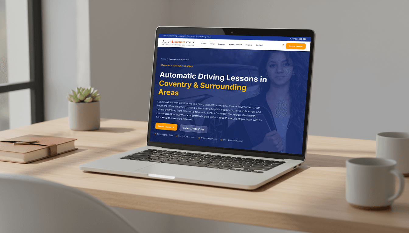
Homepage redesigned to make trust, pricing and lesson information easier to find
Project Snapshot.
Client
Auto Learners
PROJECT TYPE
Local service website redesign
Role
UX/UI design
Information architecture
Content structure
Page design
Local SEO structure
Platform
Responsive marketing website
Focus Areas
Trust and credibility
Page hierarchy and navigation
Local landing pages
Pricing visibility
Contact flow and enquiry conversion
The Challenge.
The original website had useful information, but it was not working hard enough for the business.
Key details were either unclear, outdated or spread too thinly across the site. Messaging no longer fully reflected the current business, trust signals were inconsistent, and important user questions such as lesson types, areas covered, pricing and booking next steps needed clearer answers.
The challenge was to create a website that felt more credible, more focused and easier to navigate, while also supporting local search intent across Coventry and surrounding areas.
What I Set Out to Improve
The work focused on improving clarity, trust and the overall enquiry journey.
Create a clearer page structure around lessons, areas, pricing and contact
Make trust signals more visible and more consistent
Improve local relevance with dedicated area pages
Reduce friction in the enquiry journey
Make the content more useful for real users, not just more keyword-heavy
My Approach.
I approached the project as a content and structure problem first, not a styling exercise.
The starting point was understanding what a potential learner would need to know before making contact. That led to a clearer page hierarchy built around the most important questions: what kind of lessons are offered, who they are for, which areas are covered, how much they cost, and how to book or ask a question.
From there, I reworked the site around a more practical set of pages and clearer user pathways, with stronger links between service information, local area content and conversion points.
Information Architecture.

Information architecture restructured around a clearer, more focused set of pages
Key Design Decisions.

Pricing made more visible to support comparison and quicker decision-making
Local Landing Page Pattern.
One of the most useful parts of the project was creating a repeatable structure for local area pages. Each page followed the same overall framework, but the wording was adjusted so the pages did not feel cloned.
Location-specific hero
Short local introduction
Local road or learning context
Pricing visibility
Pickup flexibility
Short FAQs
Related area links
Clear enquiry CTA
This helped create a stronger local page system without making the website feel repetitive.
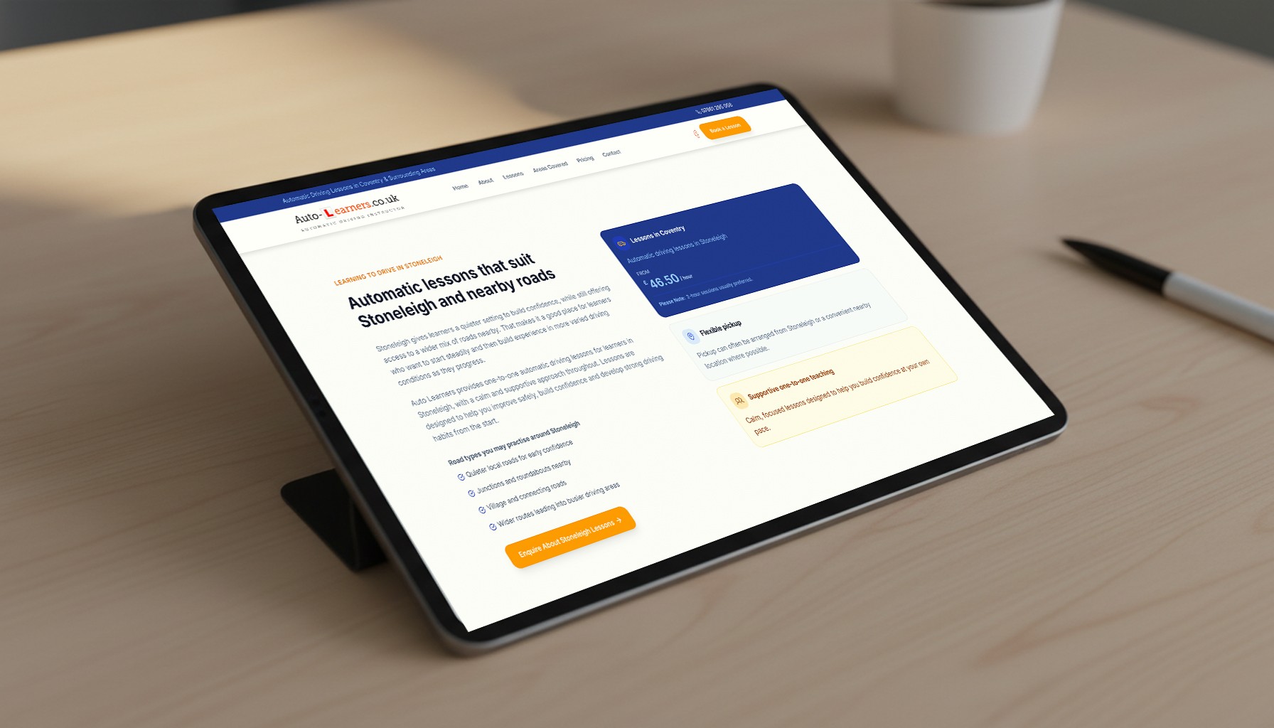
Local landing page pattern created to support area-specific content without feeling repetitive
Example Page Improvements.

Contact journey simplified to reduce friction and make next steps clearer
Content Strategy.
A big part of the work was improving how the business explained itself. The content needed to feel clear, local, calm, trustworthy, and helpful to beginners and nervous learners. I avoided generic small-business wording and focused instead on the real decision points users care about, such as lesson type, area coverage, price clarity, pickup flexibility and confidence-building support.
Outcome.
The end result was a clearer, more structured website that better supports the needs of both the business and the learner.
Stronger and more consistent page structure
Clearer service and pricing communication
More credible local landing pages
Better balance between SEO and usability
Simpler and more reassuring route to enquiry
Reflection.
This project was a good example of applying product thinking to a smaller business website.
The challenge was not technical complexity in the same way as enterprise software, but it still required careful thinking around content hierarchy, trust, repeated page systems, and user intent.
It reinforced something I value in all design work: even smaller websites benefit from the same fundamentals as larger digital products. Clear structure, useful content, consistent page patterns and strong user pathways make a big difference.
Want to see more work?
Explore other case studies across product design, workflow UX, design systems and digital platforms.
"/><stop offset="1" stop-color="rgba(168, 85, 247, 0.7)"/></linearGradient></defs><g d="M 0 14 C 0 6.268 6.268 0 14 0 L 34 0 C 41.732 0 48 6.268 48 14 L 48 34 C 48 41.732 41.732 48 34 48 L 14 48 C 6.268 48 0 41.732 0 34 Z M 30 18 L 18 18 C 17.172 18 16.5 18.672 16.5 19.5 L 16.5 28.5 C 16.5 29.328 17.172 30 18 30 L 30 30 C 30.828 30 31.5 29.328 31.5 28.5 L 31.5 19.5 C 31.5 18.672 30.828 18 30 18 Z M 31.5 20.5 L 24.773 24.775 C 24.3 25.071 23.7 25.071 23.227 24.775 L 16.5 20.5" fill="transparent" height="48px" id="RD03ycJ7h" width="48px"><path d="M 0 14 C 0 6.268 6.268 0 14 0 L 34 0 C 41.732 0 48 6.268 48 14 L 48 34 C 48 41.732 41.732 48 34 48 L 14 48 C 6.268 48 0 41.732 0 34 Z" fill="url(%23UBkH_84o4-2645693222-linear-gradient)" height="48px" id="UBkH_84o4" width="48px"/><path d="M 13.5 0 L 1.5 0 C 0.672 0 0 0.672 0 1.5 L 0 10.5 C 0 11.328 0.672 12 1.5 12 L 13.5 12 C 14.328 12 15 11.328 15 10.5 L 15 1.5 C 15 0.672 14.328 0 13.5 0 Z" fill="transparent" height="12px" id="g2WQr16BD" stroke-dasharray="" stroke-linecap="round" stroke-linejoin="round" stroke-width="1.5" stroke="rgb(124, 134, 255)" transform="translate(16.5 18)" width="15px"/><path d="M 15 0 L 8.273 4.275 C 7.8 4.571 7.2 4.571 6.727 4.275 L 0 0" fill="transparent" height="4.497321615343026px" id="zzJBlWQur" stroke-dasharray="" stroke-linecap="round" stroke-linejoin="round" stroke-width="1.5" stroke="rgb(124, 134, 255)" transform="translate(16.5 20.5)" width="15px"/></g></svg>)
"/><stop offset="1" stop-color="rgba(168, 85, 247, 0.7)"/></linearGradient></defs><g d="M 0 14 C 0 6.268 6.268 0 14 0 L 34 0 C 41.732 0 48 6.268 48 14 L 48 34 C 48 41.732 41.732 48 34 48 L 14 48 C 6.268 48 0 41.732 0 34 Z M 15 15 L 33 15 L 33 33 L 15 33 Z M 31.498 27.69 L 31.498 29.94 C 31.5 30.362 31.324 30.766 31.012 31.052 C 30.701 31.337 30.284 31.478 29.863 31.44 C 27.555 31.189 25.339 30.401 23.391 29.138 C 21.579 27.986 20.043 26.45 18.891 24.638 C 17.623 22.681 16.834 20.453 16.588 18.135 C 16.55 17.716 16.69 17.3 16.974 16.989 C 17.258 16.678 17.66 16.5 18.081 16.5 L 20.331 16.5 C 21.084 16.493 21.726 17.044 21.831 17.79 C 21.926 18.51 22.101 19.217 22.356 19.898 C 22.562 20.446 22.43 21.064 22.018 21.48 L 21.066 22.433 C 22.134 24.311 23.688 25.865 25.566 26.933 L 26.518 25.98 C 26.935 25.568 27.553 25.437 28.101 25.643 C 28.781 25.896 29.488 26.073 30.208 26.168 C 30.962 26.274 31.517 26.929 31.498 27.69 Z" fill="transparent" height="48px" id="qz03A0Evi" width="48px"><path d="M 0 14 C 0 6.268 6.268 0 14 0 L 34 0 C 41.732 0 48 6.268 48 14 L 48 34 C 48 41.732 41.732 48 34 48 L 14 48 C 6.268 48 0 41.732 0 34 Z" fill="url(%23LVO83Orll-3130066706-linear-gradient)" height="48px" id="LVO83Orll" width="48px"/><g d="M 0 0 L 18 0 L 18 18 L 0 18 Z M 16.498 12.69 L 16.498 14.94 C 16.5 15.362 16.324 15.766 16.012 16.052 C 15.701 16.337 15.284 16.478 14.863 16.44 C 12.555 16.189 10.339 15.401 8.391 14.138 C 6.579 12.986 5.043 11.45 3.891 9.638 C 2.623 7.681 1.834 5.453 1.588 3.135 C 1.55 2.716 1.69 2.3 1.974 1.989 C 2.258 1.678 2.66 1.5 3.081 1.5 L 5.331 1.5 C 6.084 1.493 6.726 2.044 6.831 2.79 C 6.926 3.51 7.101 4.217 7.356 4.898 C 7.562 5.446 7.43 6.064 7.018 6.48 L 6.066 7.433 C 7.134 9.311 8.688 10.865 10.566 11.933 L 11.518 10.98 C 11.935 10.568 12.553 10.437 13.101 10.643 C 13.781 10.896 14.488 11.073 15.208 11.168 C 15.962 11.274 16.517 11.929 16.498 12.69 Z" fill="transparent" height="18px" id="favLILUhD" transform="translate(15 15)" width="18px"><path d="M 0 0 L 18 0 L 18 18 L 0 18 Z" fill="transparent" height="18px" id="raGfJ1I2P" width="18px"/><path d="M 14.916 11.19 L 14.916 13.44 C 14.918 13.863 14.742 14.266 14.43 14.552 C 14.119 14.837 13.702 14.978 13.281 14.94 C 10.973 14.689 8.757 13.901 6.809 12.638 C 4.997 11.487 3.461 9.95 2.309 8.138 C 1.041 6.181 0.252 3.954 0.006 1.635 C -0.032 1.216 0.108 0.8 0.392 0.489 C 0.676 0.178 1.078 0 1.499 0 L 3.749 0 C 4.502 -0.007 5.144 0.545 5.249 1.29 C 5.344 2.01 5.519 2.717 5.774 3.398 C 5.98 3.946 5.848 4.564 5.436 4.98 L 4.484 5.933 C 5.552 7.811 7.106 9.365 8.984 10.433 L 9.936 9.48 C 10.353 9.068 10.971 8.937 11.519 9.143 C 12.199 9.396 12.906 9.573 13.626 9.668 C 14.38 9.774 14.935 10.429 14.916 11.19 Z" fill="transparent" height="14.946263091769715px" id="Arifn3Rw3" stroke-dasharray="" stroke-linecap="round" stroke-linejoin="round" stroke-width="1.5" stroke="rgb(124, 134, 255)" transform="translate(1.582 1.5)" width="14.916548725928656px"/></g></g></svg>)
"/><stop offset="1" stop-color="rgba(168, 85, 247, 0.7)"/></linearGradient></defs><g d="M 0 14 C 0 6.268 6.268 0 14 0 L 34 0 C 41.732 0 48 6.268 48 14 L 48 34 C 48 41.732 41.732 48 34 48 L 14 48 C 6.268 48 0 41.732 0 34 Z M 15 15 L 33 15 L 33 33 L 15 33 Z M 27 21 C 29.485 21 31.5 23.015 31.5 25.5 L 31.5 30.75 L 28.5 30.75 L 28.5 25.5 C 28.5 24.672 27.828 24 27 24 C 26.172 24 25.5 24.672 25.5 25.5 L 25.5 30.75 L 22.5 30.75 L 22.5 25.5 C 22.5 23.015 24.515 21 27 21 Z M 19.5 21.75 L 16.5 21.75 L 16.5 30.75 L 19.5 30.75 Z M 18 19.5 C 18.828 19.5 19.5 18.828 19.5 18 C 19.5 17.172 18.828 16.5 18 16.5 C 17.172 16.5 16.5 17.172 16.5 18 C 16.5 18.828 17.172 19.5 18 19.5 Z" fill="transparent" height="48px" id="ZGXi8g89p" width="48px"><path d="M 0 14 C 0 6.268 6.268 0 14 0 L 34 0 C 41.732 0 48 6.268 48 14 L 48 34 C 48 41.732 41.732 48 34 48 L 14 48 C 6.268 48 0 41.732 0 34 Z" fill="url(%23RZgX40uo4-2242907706-linear-gradient)" height="48px" id="RZgX40uo4" width="48px"/><g d="M 0 0 L 18 0 L 18 18 L 0 18 Z M 12 6 C 14.485 6 16.5 8.015 16.5 10.5 L 16.5 15.75 L 13.5 15.75 L 13.5 10.5 C 13.5 9.672 12.828 9 12 9 C 11.172 9 10.5 9.672 10.5 10.5 L 10.5 15.75 L 7.5 15.75 L 7.5 10.5 C 7.5 8.015 9.515 6 12 6 Z M 4.5 6.75 L 1.5 6.75 L 1.5 15.75 L 4.5 15.75 Z M 3 4.5 C 3.828 4.5 4.5 3.828 4.5 3 C 4.5 2.172 3.828 1.5 3 1.5 C 2.172 1.5 1.5 2.172 1.5 3 C 1.5 3.828 2.172 4.5 3 4.5 Z" fill="transparent" height="18px" id="xiGpC7gxs" transform="translate(15 15)" width="18px"><path d="M 0 0 L 18 0 L 18 18 L 0 18 Z" fill="transparent" height="18px" id="LKjvyDFNi" width="18px"/><path d="M 10.5 4.5 C 12.985 4.5 15 6.515 15 9 L 15 14.25 L 12 14.25 L 12 9 C 12 8.172 11.328 7.5 10.5 7.5 C 9.672 7.5 9 8.172 9 9 L 9 14.25 L 6 14.25 L 6 9 C 6 6.515 8.015 4.5 10.5 4.5 Z M 3 5.25 L 0 5.25 L 0 14.25 L 3 14.25 Z M 1.5 3 C 2.328 3 3 2.328 3 1.5 C 3 0.672 2.328 0 1.5 0 C 0.672 0 0 0.672 0 1.5 C 0 2.328 0.672 3 1.5 3 Z" fill="transparent" height="14.25px" id="RhvxDUI1Y" stroke-dasharray="" stroke-linecap="round" stroke-linejoin="round" stroke-width="1.5" stroke="rgb(124, 134, 255)" transform="translate(1.5 1.5)" width="15px"/></g></g></svg>)